Friday 27 June 2014

Use every stamp in the set

Hello and welcome. The title to this post is the name of the new challenge at A Vintage Journey challenge blog, inspired by Tim Holtz and this tag is my entry.

I started by sprizting the tag with water; I added Distress Stain in tea dye and bundled sage from the Tim Holtz range from Ranger, onto my craft mat. I swiped the tag through the stain and as I started to dry it with my heat tool,  I continued to spritz intermittently. Once completely dry I used the spritz and flick technique, then completed this layer adding Distress Ink.


Another of TH's tips is to tear a piece of card and use this as a mask to get a more shabby look. This is what I did here


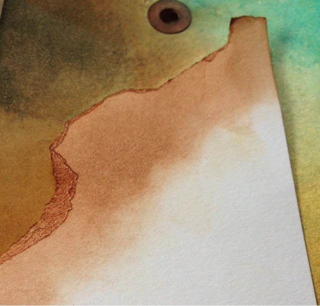
The tag was distressed at the edges with walnut stain. I aged the edges making them look tattered.


You can see these techniques demonstrated by TH here 


The stamp set I decided to use is Beautiful Mind out of the Weird Science Series from IndigoBlu. I love this set and thought it would work really well together.

The hand and the Vitruvian Man were stamped by sliding the ink pad across the stamp rather than tapping as I wanted less ink on my stamp. The other pieces were stamped in the same way. It is hard to see them on the background but if you look closely you can see that they are there. The head and large sentiments were stamped onto white card and coloured with distress ink. I cut round them and aged them in the same way as the tag.


It all came together 


Thank you for looking, take care and come back soon, because it is the weekend and there's sure to be more to see lol! 

Debs xxx
SHARE:

Thursday 26 June 2014

Kate Yetter Project

Hello and welcome to my tag inspired by Kate's tag board, which was her brilliant project for her Tuesday night GD spot on the Paper Artsy's blog.

I also chose to use colours that would meet the theme for SanDee & amelie's Steampunk Challenges

I covered my tag in French Roast Fresco acrylic paint from Paper Artsy and once it was dry added a thin coat of crackle glaze also by Paper Artsy. This was followed by a very thick coat of Nougart.


I gave a thick coat in the hope it would produce big cracks and I was not disappointed it produced deep thick cracks which I loved.


As you might see I've added a watered down Seaweed to tone down the cream of the Nougart. I stamped randomly in coffee and sepia Archival ink from Ranger, using the sentiment from Hot Picks 1008 from Paper Artsy.
I didn't have the spray inks that Kate used which I think looked lush. (Hehe! Gavin and Stacy is on as I write this, which reminds me of my daughter as she lives in Wales.) instead I used inks by Ranger. 


The blue was a glimmer mist and added a lovely shimmer.


I stamped the face from same plate and coloured her with pan pastels and pencil.


I added some flowers on a base of hessian with a few buttons.


I added 2 holes at the bottom and matched them onto another piece of card which I attached with some string, then added the whole thing to a Manila Tag.


Thanks for your visit come back soon 

Debs xxx


SHARE:

Tuesday 24 June 2014

Men only... Really!

Hello and welcome! Today I'm going to show  a Tag I made for the challenge at County View Crafts.

This challenge was chosen by Gabrielle of crafty Thoughts  and the Theme was 'Only Men Allowed'.

I thought I would use the new Decoarts Americana acrylic paint I have just purchased, (recommended by a friend) brayered onto a piece of mixed media paper by Daler  Rowney 
Colours I used were Burnt Umber, Tuscan Red and Light Green


I added some circles and dots using the drawing paint, which has a fine nib to allow you to draw with it - how cool is that! straight from the bottle.

I found a mask of a man I had downloaded from somewhere which I had cut out in acetate. I used this on the tag to mask off an area. I used Blood Orange from Paper Artsy,  a translusent paint which can be watered done even more, to give a light wash over the mask. I wanted enough colour so that the man stood out, as well as, still being able to see the stamping underneath. In areas I sanded it back to let some of the green show through. I edged the man using a white paint pen as well as going over the white swirls ( I wish I hadn't done this as it looked better before but forgot to take a picture)


The next layer was some stamping in black archival using papermania stamps urban


I added stamping randomly over the paper. To give a shabby look I roughed the edges and edged with walnut stain distress ink. I tore the paper down from the top so that it would fit my tag. Next was a coat of gesso in clear. Once dry I screwed the paper into a ball, manipulating the paper to gives lots of creases. The torn off piece were to be used later.


Smoothing out the card it felt more like like material than paper, I've never used this paper before as I've only just got it but I love it. You can do about anything to it and it still hold together.


Rubbing treasure gold in White Fire over the creases pops them off the page and adds an aged look which is what I wanted.

I added more texture by sticking the torn off pieces to the tag after they had been ages and edged with Tea Dye distress ink. I used lots of glue which made the paper very supple and it could be squished into shape becoming one with the paper on which it was stuck.


I know the theme was  'only Men Allowed' and there's no doubt this is a male Tag but I wanted to expand the term Men well, I think I did? It worked in my head, here's hoping it works in yours too. I used a bright colour card to give the Tag a bit more colour.


I added a heart pinned to some fabric pieces and some  little cogs flowery things at the bottom.


So here is my Tag


Thanks for looking. I would love to read your comments.

Bye for now Debs xxxx

SHARE:

Sunday 22 June 2014

New to old...

Hi everyone, today I went to the high Swedish Store at Thurrock to purchase some photo frames. I got the frames but also bought 3 of these.


I wanted to try and age one so used the same colours I used on a Tag recently. 

There are'nt many instruction - All products except lamp are from Paper Artsy.  I used grunge paste around the edges and in places on the window frames. Once dry painted the texture mixing my colours of Seaweed and Pumkin soup and added French Roast to give a mucky look. Painted over the whole thing in Chalk, trying not to cover all the texture.

Here are the photos.


And here it is hanging in place. 


And here it is in use


Thanks for looking, see you soon.

Debs xxx
SHARE:

Saturday 21 June 2014

Inspired by Emma's flower card, well sort of...

I still have cards to make, so when Emma did one for the Paper Artsy challenge blog last night I thought, thank you, I think I will.

I needed a male card so had to adapt the flower. The card I used was a butterfly cut one. I cut myself a piece of card to fit the front and masked off the part that would cover the butterflies.


I would take the mask off once I was finished and paint the strip in a contrasting colour. All the paint I used is from the Paper Artsy fresco Acrylic range.

I added Irish Cream and Haystacks to my card and mixed together adding a little Cinnamon to add some depth of colour.


I stamped a flower,  happy birthday round the edge and a sentiment in black archival ink. I applied a coat of satin glaze which is lovely.


I added some more stamping in a lighter colour. I wanted it to be less prominent.


A die cut flower, which I had stamped, was secured with a brad and clock hand to the card. I added a few splatters to finish off. The card did deviate from Emma's but it has a stamped and painted background, a flower which has stamping on it, lol.


Once I'd finished I took the mask off the back and painted it in Baltic Blue.


Once it was dry I attached the front to the card. This gives colour to the background of the butterflies when you open the card.


Thank you stopping by, see you soon

Debsxx

SHARE:

Birds

Hello, I'm so excited about this tag, I have just loved making it. I hope you like it too lol. I was inspired to think 'wings' by the Vintage Journey  Blog challenge, theme of wings and things. I wanted to use birds as it is not something I usually do and thought it would be fun.

This is also the challenge at Thats's Crafty blog, so I'm entering that as well.

Well...

It didn't exactly emerge with birds in the way I had thought, but does have a few birds. I hope it's enough to qualify to enter the challenge, but if not it was still a really fun project to make.

Now, if I were you I'd grab a cuppa and a biscuit, because this post is a bit picture heavy!

I used 3 distress inks to colour my tag, then used the spritz and flick technique from Tim Holtz which you can see here


Once it had dried I placed my bird stencil on the tag and used a baby wipe to remove some of the ink. Dyan Reaveley calls this ghosting, check out her demonstration. This left a lovely ethereal quality to the tag which I loved.


Taking this a step further, I used a mask with people and spritzed on my tag similar dylusions colours by Ranger. As I removed the mask I placed them face down on the tag to add more depth. I allowed this to dry. 


I applied grunge paste through a stencil and let it dry. I cannot remember where either of the stencils came from so if you know please let me know and I will update details.  Leandra at Paper Artsy demonstrates this on their YouTube Channel.

Once it had dried, I coloured it with a mix of yellow and green spray ink. I touched this with a tiny amount of french Roast Fresco finish paints, and then an even teenier amount of Spanish Topaz, treasure gold. 


I wanted a sentiment to reflect birds and found this quote by Robert Lynd on this web site.


In order to see birds it is necessary...
...to become part of the silence.

I really liked it and thought it fitted nicely. 

Once this was stamped on I felt the tag needed framing and edged it lightly with the French Roast  and finished with some binding ribbon coloured to match.


Thank you looking, I would love to read your thoughts. 

Bye for now! debs xx

SHARE:

Friday 20 June 2014

It's All Red

Hello and welcome, another one from me tonight featuring the colour red. This is not a colour I would normally choose, but I thought it would be nice to enter the challenge at the Artisic Stamper blog, and the theme is red. Check out the inspiration

I started by painting my tag red using Blood Red Claret and Brown Shed fresco finish paints from Paper Artsy.


On top of this I stamped a tree bark effect from Creative Expressions in Potting Soil Archival Ink. 
Using French Roast Fresco finish to darken the edges.


I stamped some elements  and painted them with Taupe Fresco Finish and Barn Door distress ink. 


Now I stamped the feature in Black Archival Ink and put it together.


Thanks for stopping by. Take care.

Debs xxx
SHARE:

Imagine

Hello, I'm still feeling pretty rough but head has cleared so managed to play for a bit. I didn't start out with anything in mind and tbh, probably sat for about 30min thinking,  what shall I do? Before I got going, lol. I started inking a mantilla tag with Old Paper and Vintage photo. Then going through my stamps came across this Hot Picks 1203  from Paper Artsy.


I've hardly used so many of my stamps that I thought it's time to get them out and have a play. So using Sepia Archival ink I stamped onto my tag.


I then gathered some bits, punched out butterflies from Tonic and painted a central feature, which is a stamp from Chocolate Baroque  called Tranquility, 3 nibs from Tim Holtz, as well as some trellis which I had painted, and embossed to get an aged weathered look. I wanted it to look like a metal fence or gate. I was inspired by Jo from JOFY who has old gates in her garden which plants grow up. Take a look.


I made my butterflies. I love this look. I first saw it used by a twitter mate Alison Hall on this 


I stamped a sentiment 


And put it all together. 


Thank you for visiting, come back soon 

Debs xxxx

SHARE:
BLOGGER TEMPLATE CREATED BY pipdig